AscendyX Website Redesign Sep 2026
My role
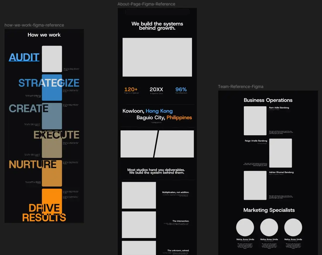
The AscendyX founders asked me to redesign their whole website and build it properly. I designed the key frames in Figma and designed the rest directly in code as I built it: the frontend, the contact backend, and the deployment.
Where it started
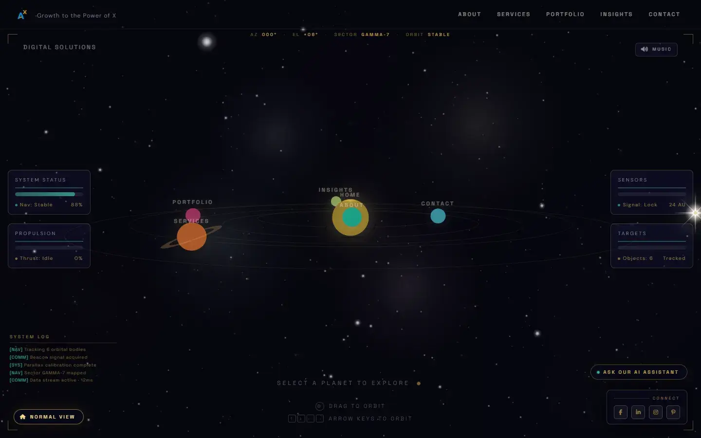
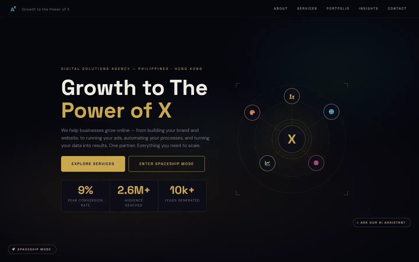
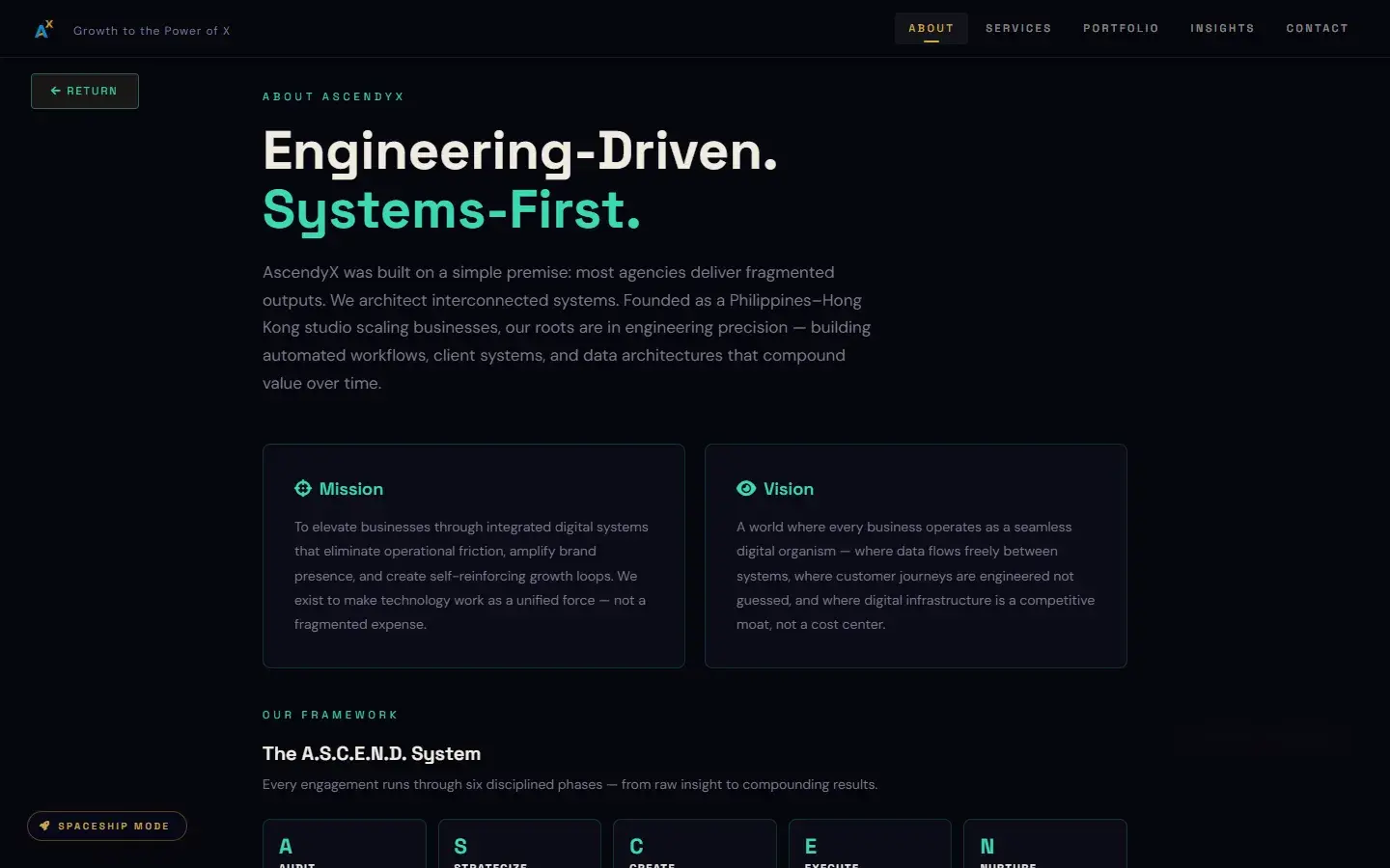
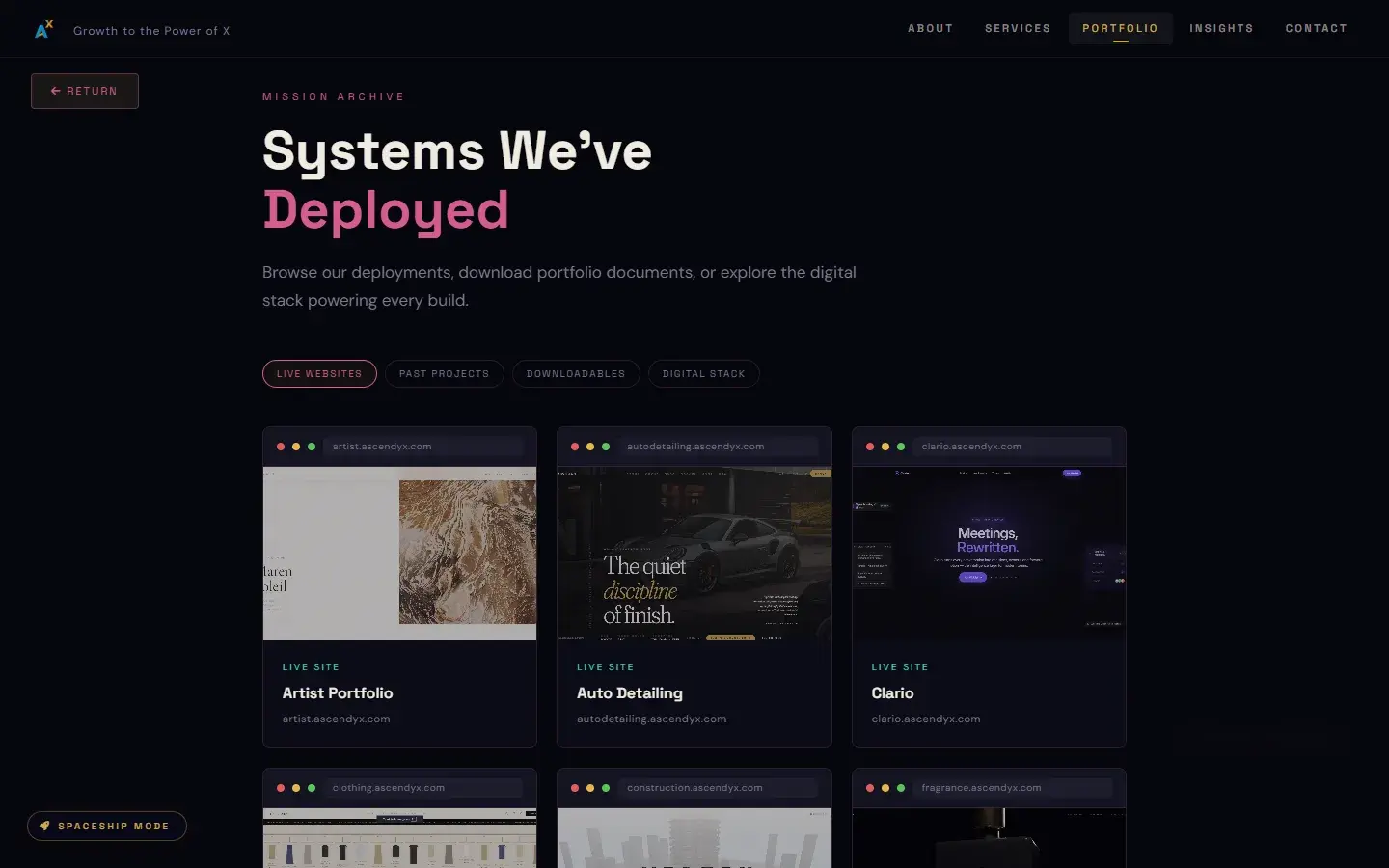
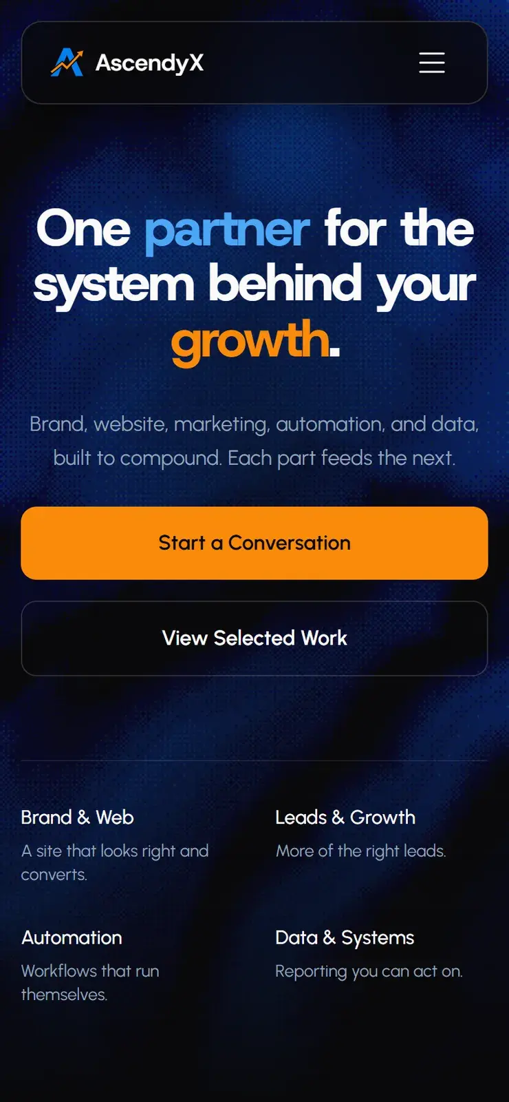
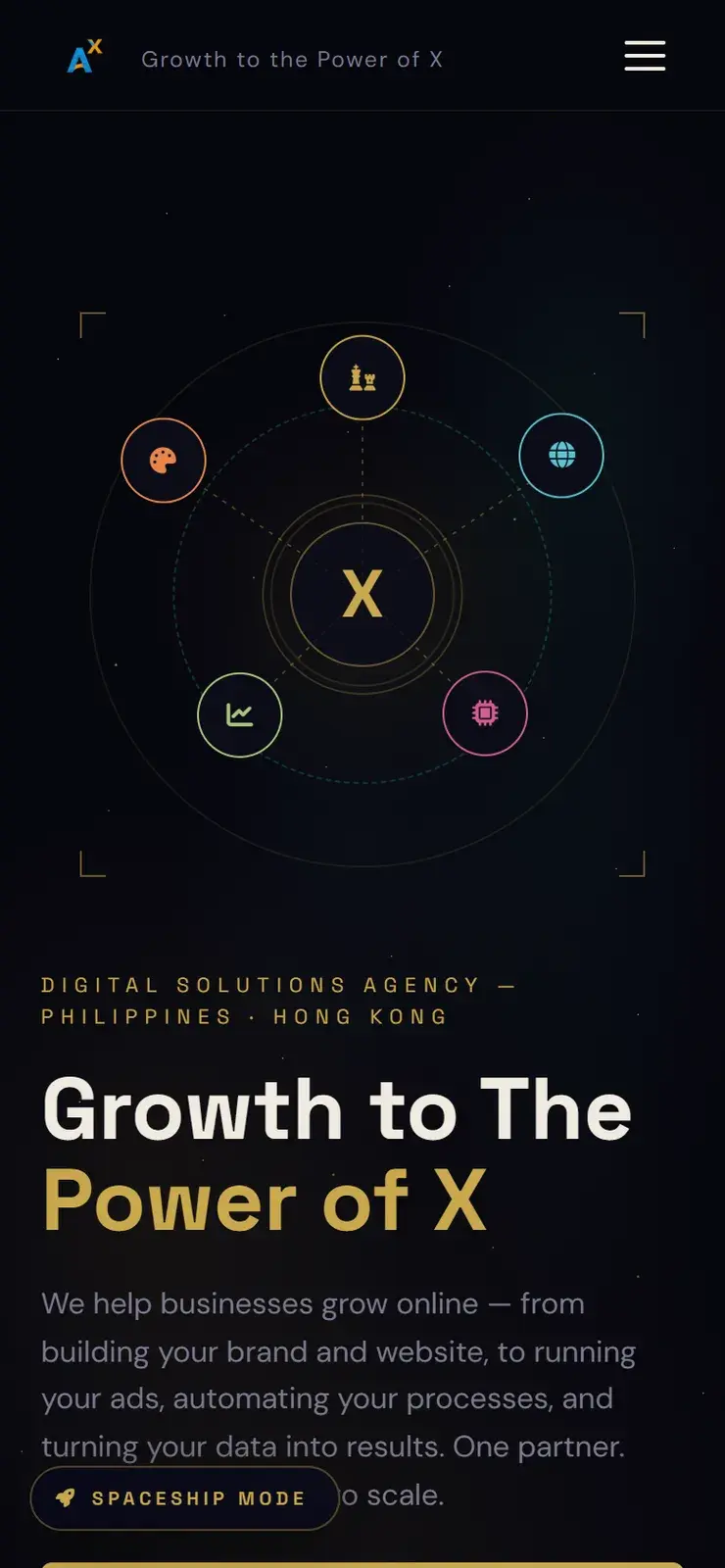
The original site was a single page on a dark background with gold accents. It opened with an intro and background music, and it had a Spaceship Mode: a 3D solar system that doubled as the menu, with a HUD around it and an AI assistant chat. The home page led with stats like a 9% peak conversion rate and 2.6M+ audience reached.
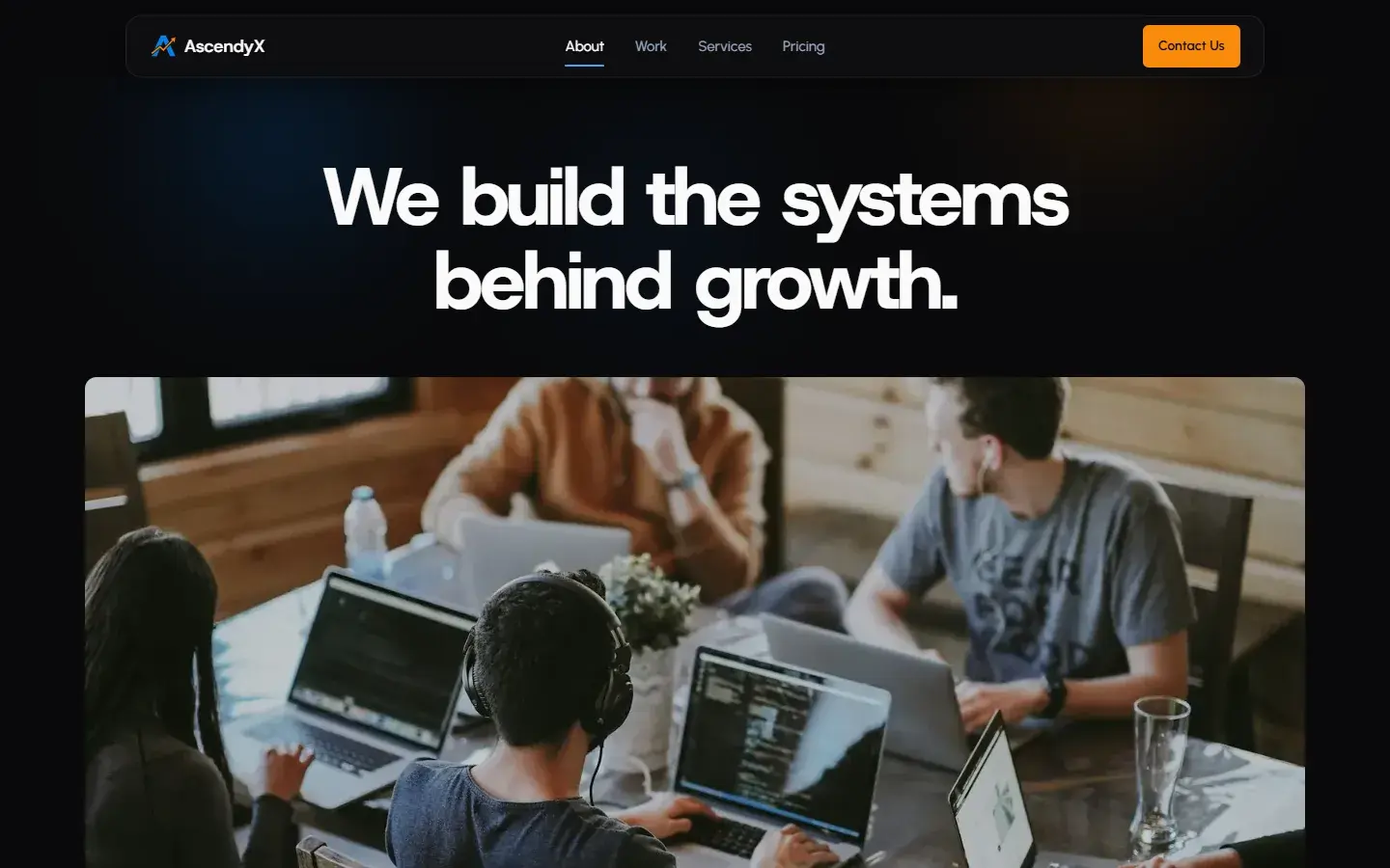
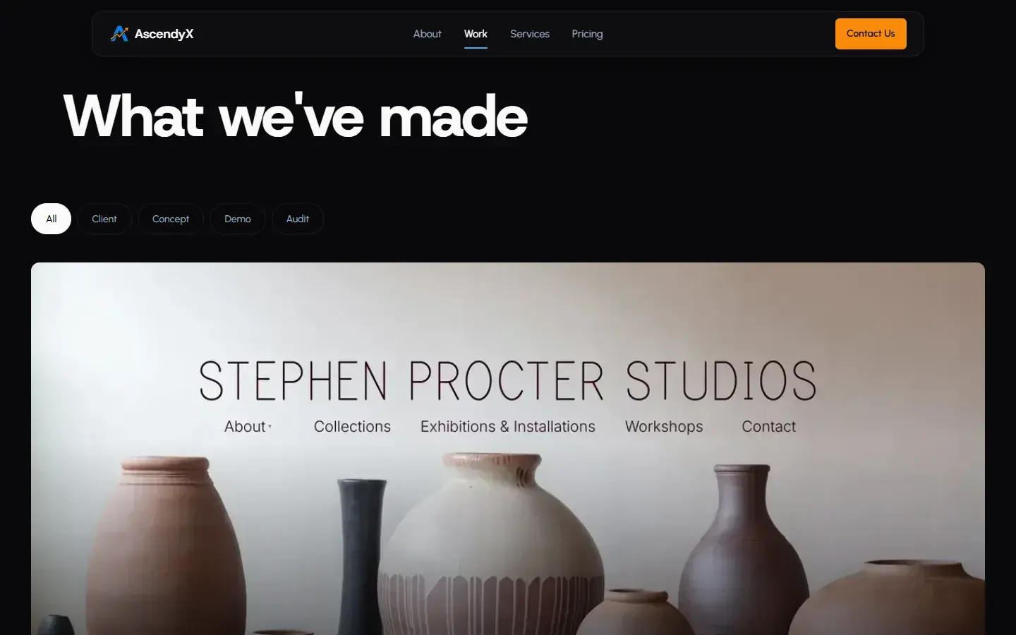
Original and current site
My direction
I wanted the site to sell before it entertained. Spaceship Mode, the music, the AI chat, and the overlay pages all came out, so a visitor reaches the offer, the work, and the contact form in fewer steps.
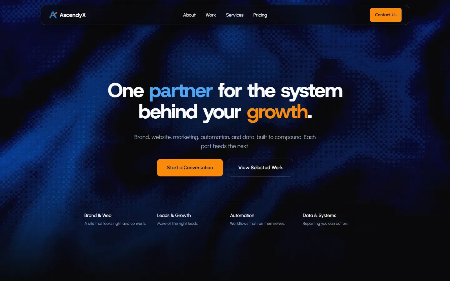
I kept the dark base on purpose, so the change reads as the same company growing up, and took the colors back to the AscendyX logo's blue and orange instead of gold. The dark mood was not the only thing that stayed. The X motif carried over, and the way the services were grouped shaped the new services pages.
The original's fonts felt generic, so I built a new set. Host Grotesk at a heavy weight carries the headings, because a dense grotesk makes a one-line promise land. Urbanist handles the long service and case study copy, where it stays easy to read. Geist Mono sits on numbers and small labels, a quiet signal of the systems and data side of the studio.
For the structure I put three things first: the shortest path to contact, real work up front, and mobile. Every page ends in a way to start a conversation, and the contact form actually sends. The original leaned on numbers it did not back up, so those stats came out and real case studies carry that weight instead.
Under the surface, I rebuilt it as a multi-page Next.js site instead of one large HTML file. The contact form sends messages through a Node route, images are resized and converted to WebP, and the site has its own tests.
The early build
Before the final design landed, the redesign went through an early build. It already had the new structure and headline, but the pages were plain, the work index had empty placeholder cards, and the contact form only opened an email draft.
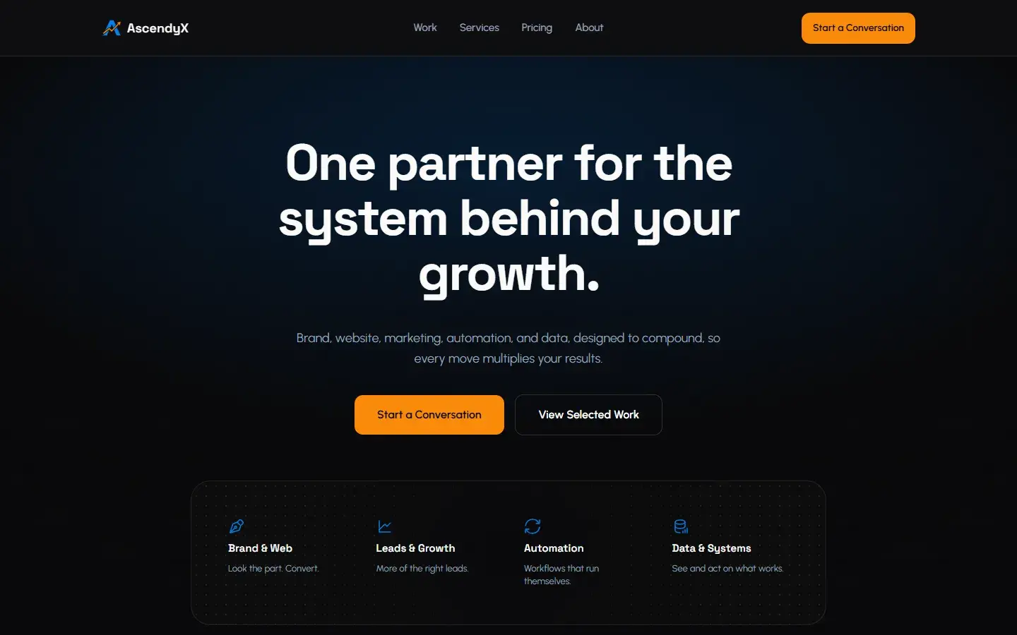
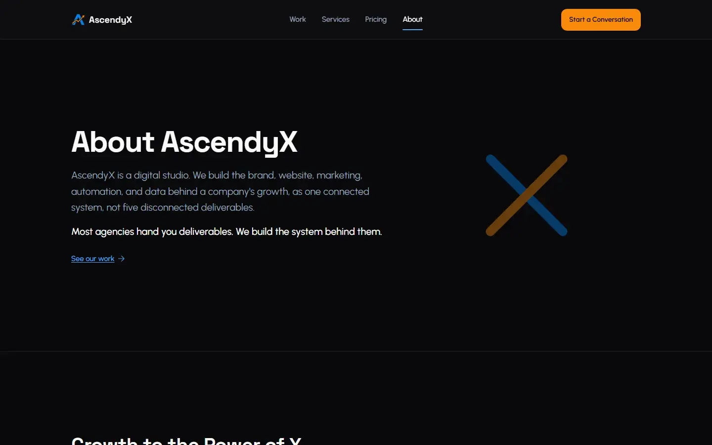
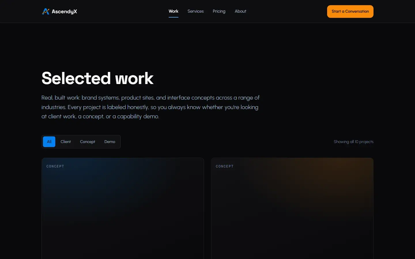
The current site kept that structure and added the visual layer: the textured blue hero, photography on the about page, image-led case study cards, and a working contact form.
What was hard
The hardest call was killing Spaceship Mode. It was the most eye-catching thing on the original, and I had to make the case that it cost more than it gave. The early build also stayed plain for too long, with placeholders where the work should have been. And the content took longer than the code: gathering case studies and real photos was slower than building pages.
What I gained
This was my first full redesign from Figma to a deployed site. It taught me to defend a design decision instead of only making something look better, it made me stricter about engineering, and it showed me that taking a flashy feature out can make a site better.